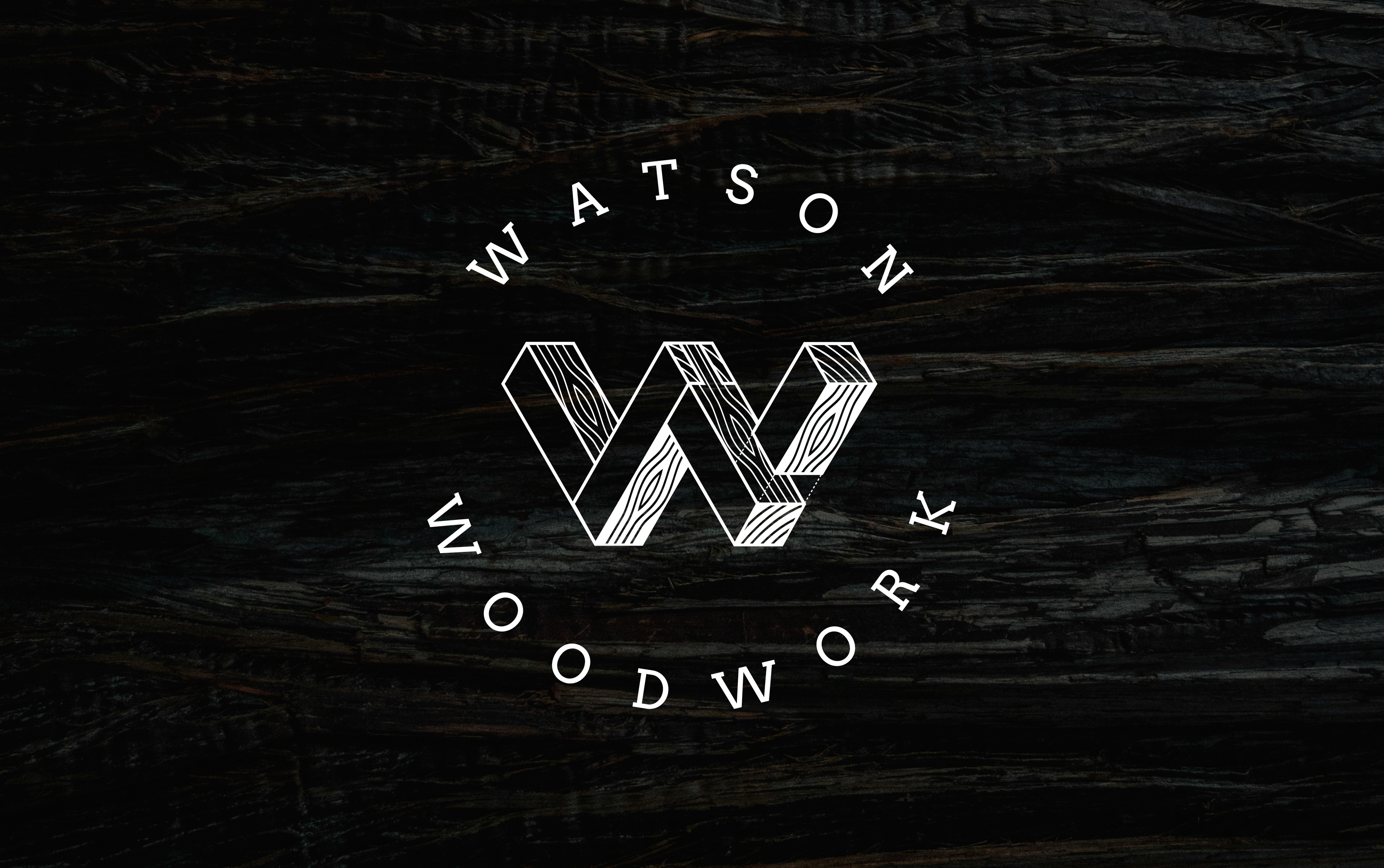


Watson Woodwork
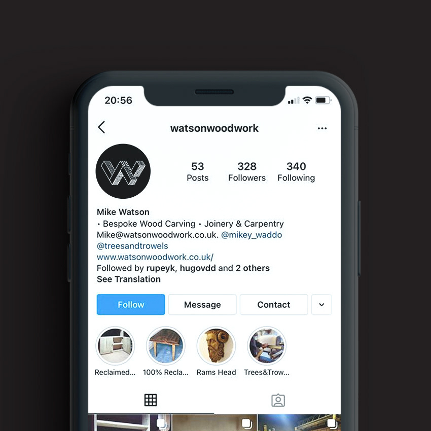
Bristol based master craftsman Mike Watson approached me to help solidify his brand presence after many years trading without a clear visual identity. Having always traded off the quality of his work, his business and reach is growing, and he now needed a visual identity to support this.
Specialising in Bespoke one-off design pieces, Watson woodwork hand build all their pieces, using traditional tools and techniques. They wanted a mark that celebrated these beautiful, iconic woodworking techniques. The 'mortice and tenon' the 'dovetail' are works or art in their own right.
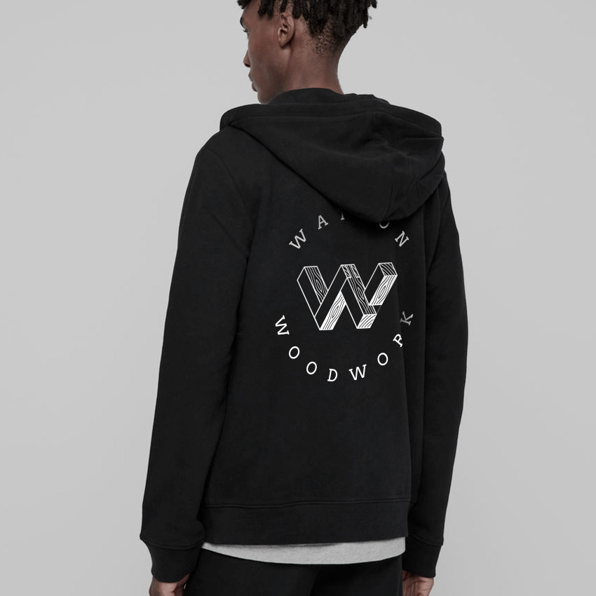
Their custom W mark not only illustrates precision and craft, but also conveys the character and charm of the raw material they know and love.