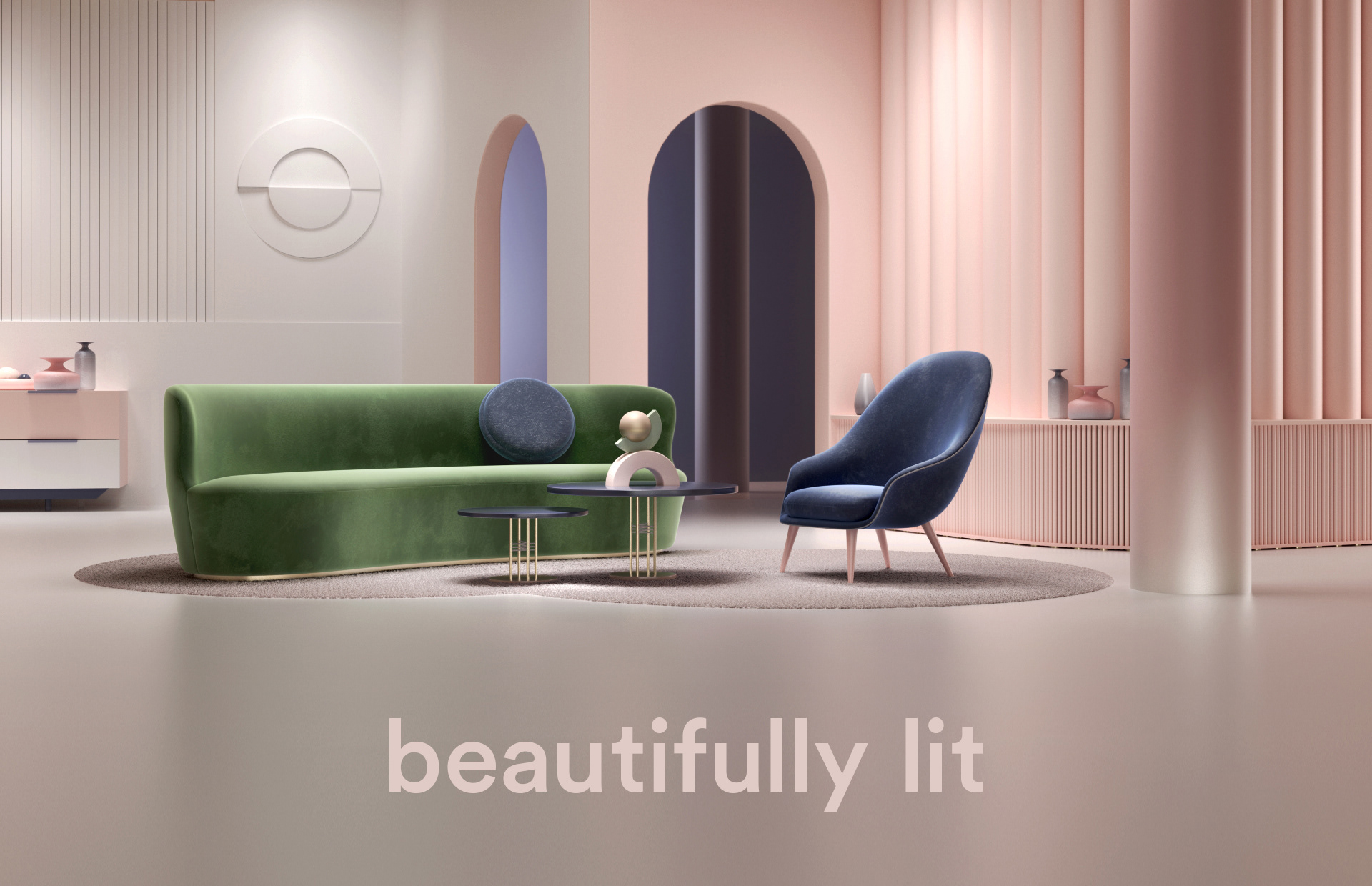

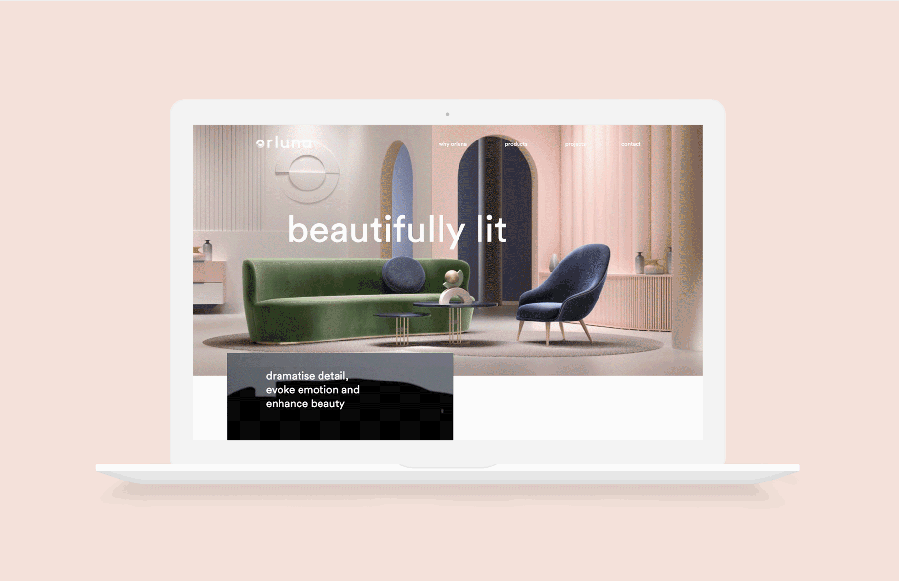
Beautifully lit
Orluna believes the right lighting doesn’t just transform a space, but also the mood of those within it. And whilst you may not know their name, you’re likely to have seen their work. The brand was founded in 1973, since then it has become the choice of pre-eminent lighting designers the world over, with lights gracing countless businesses, high-end hotels, premium retail spaces and residences.
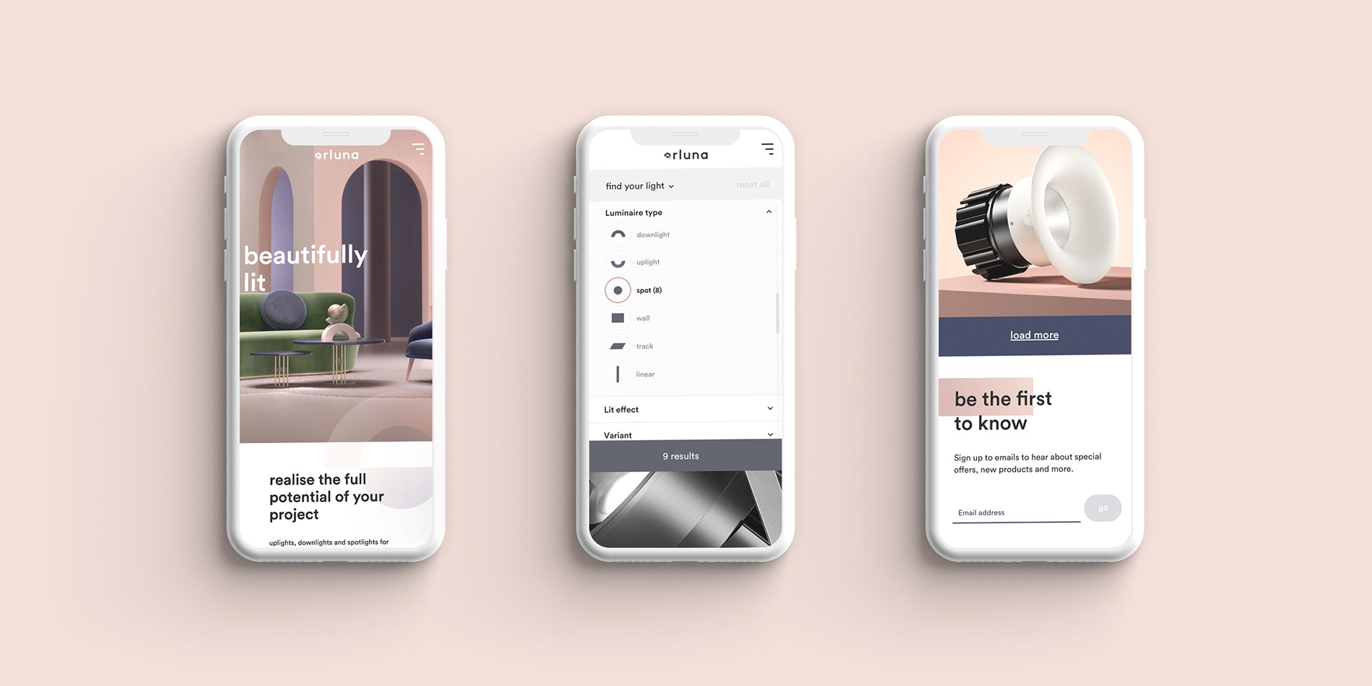
Our brief was to appeal to a broader audience beyond lighting designers, to include interior designers and architects. And to reassure end customers from the world’s most beautiful commercial and residential properties that Orluna is the right choice.
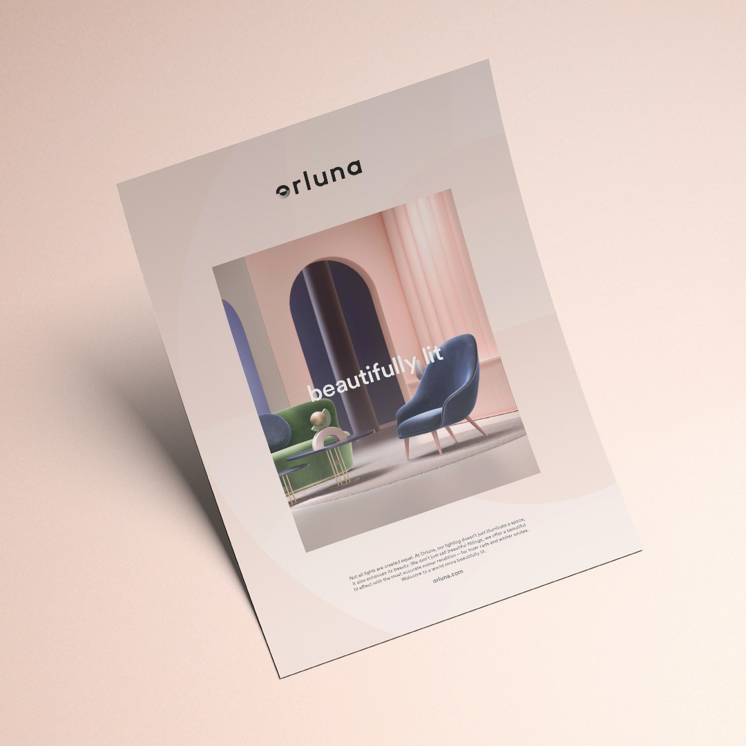
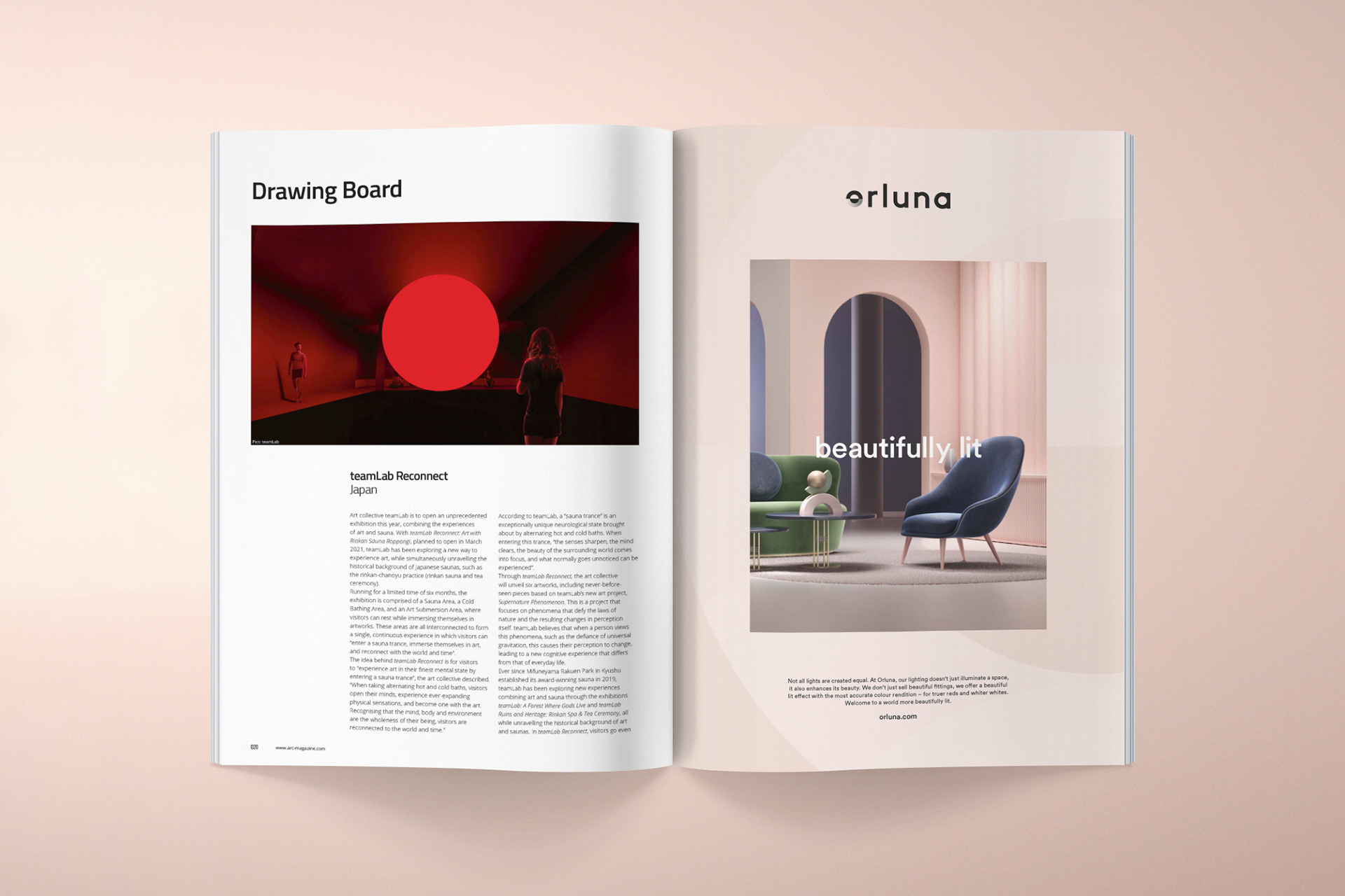
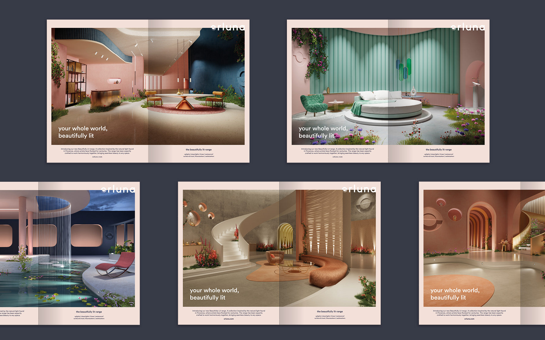
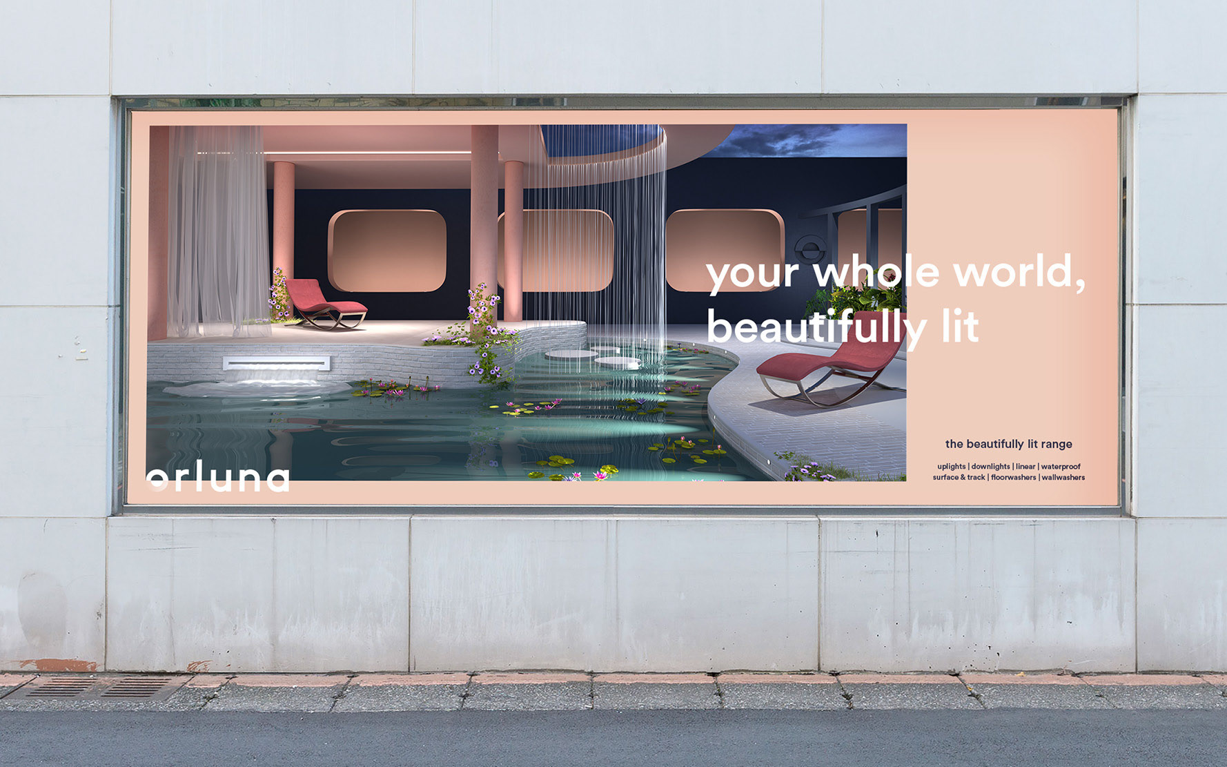
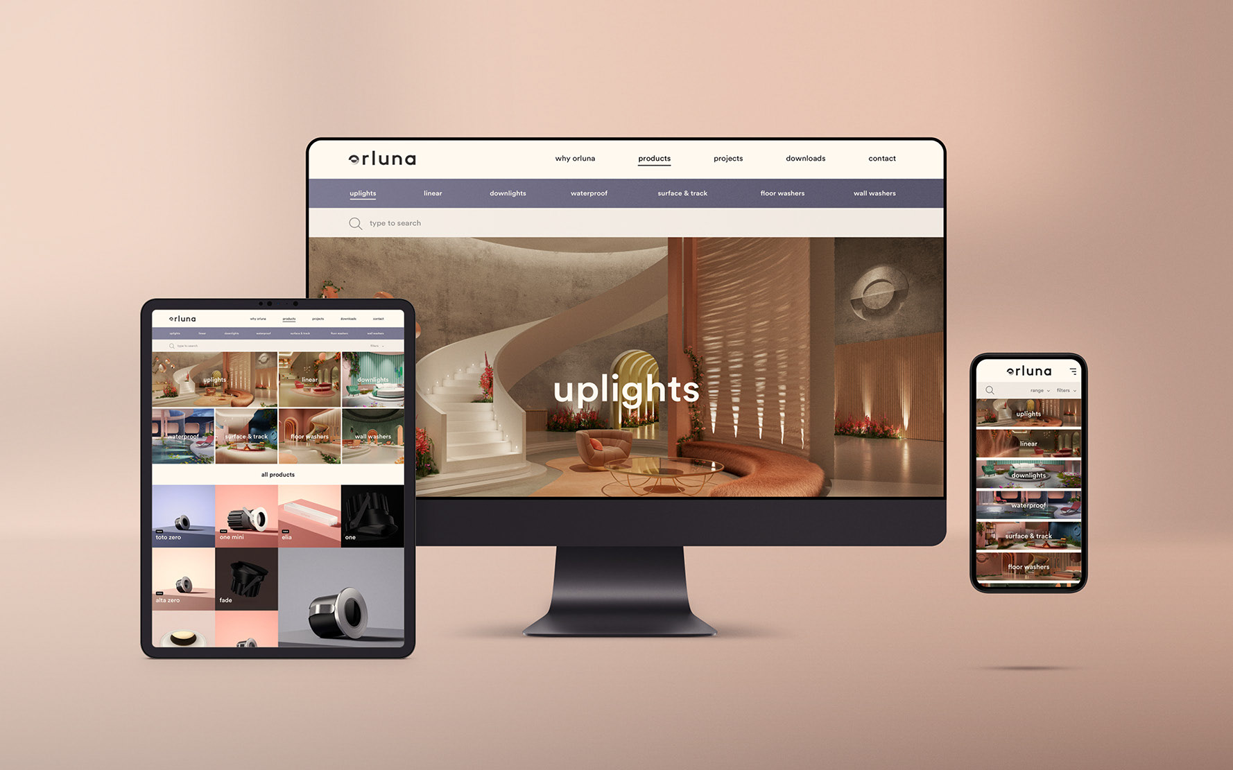
We completely repositioned the brand, to be aspiration-led. This new brand position challenges previous perceptions, and champions a mission to offer the world’s best lit effect. The launch of ‘Beautifully Lit’ and a completely new visual identity beautifully executed across a new website and full range of brand collateral.
Our Design Solution.
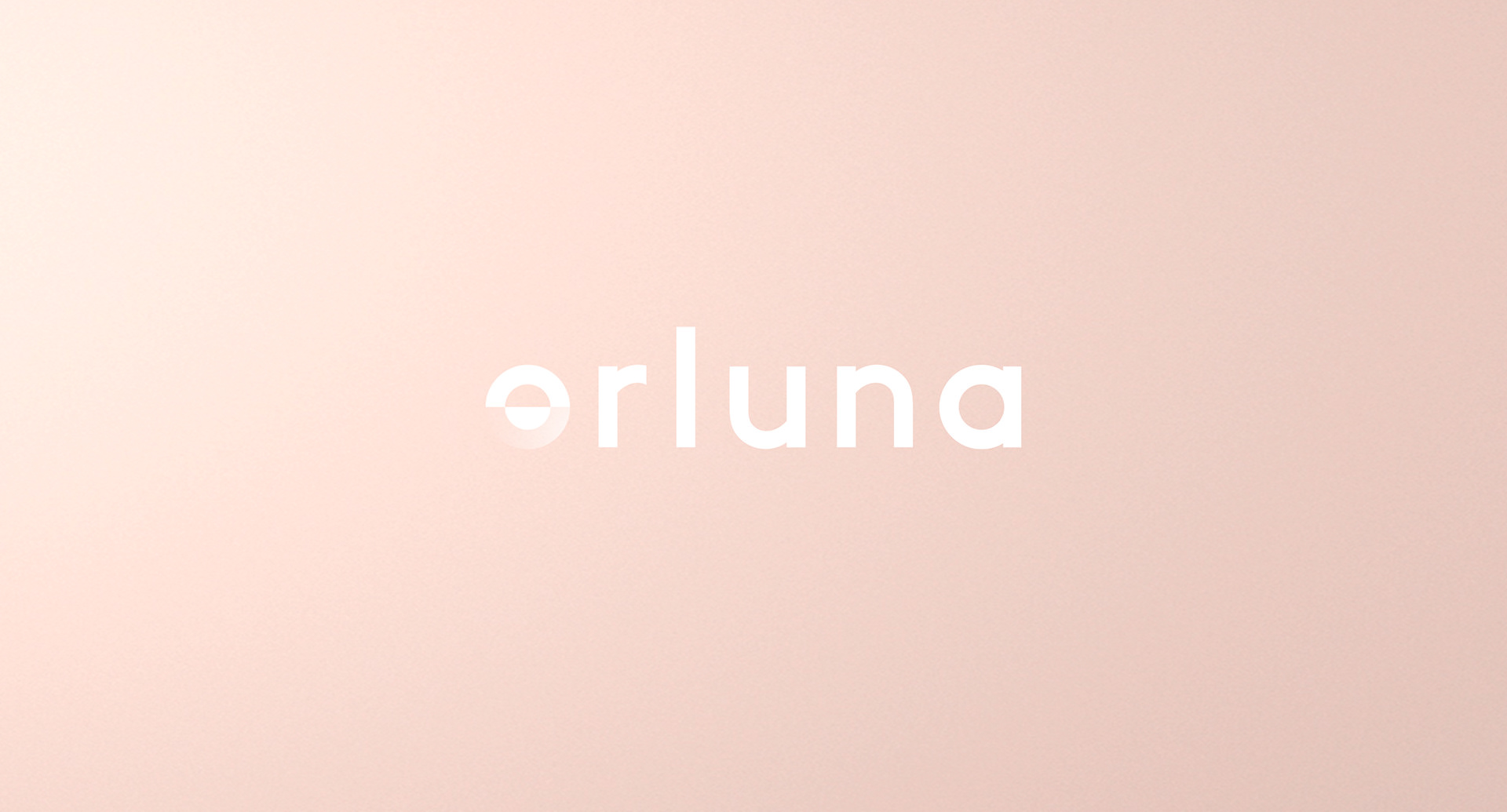
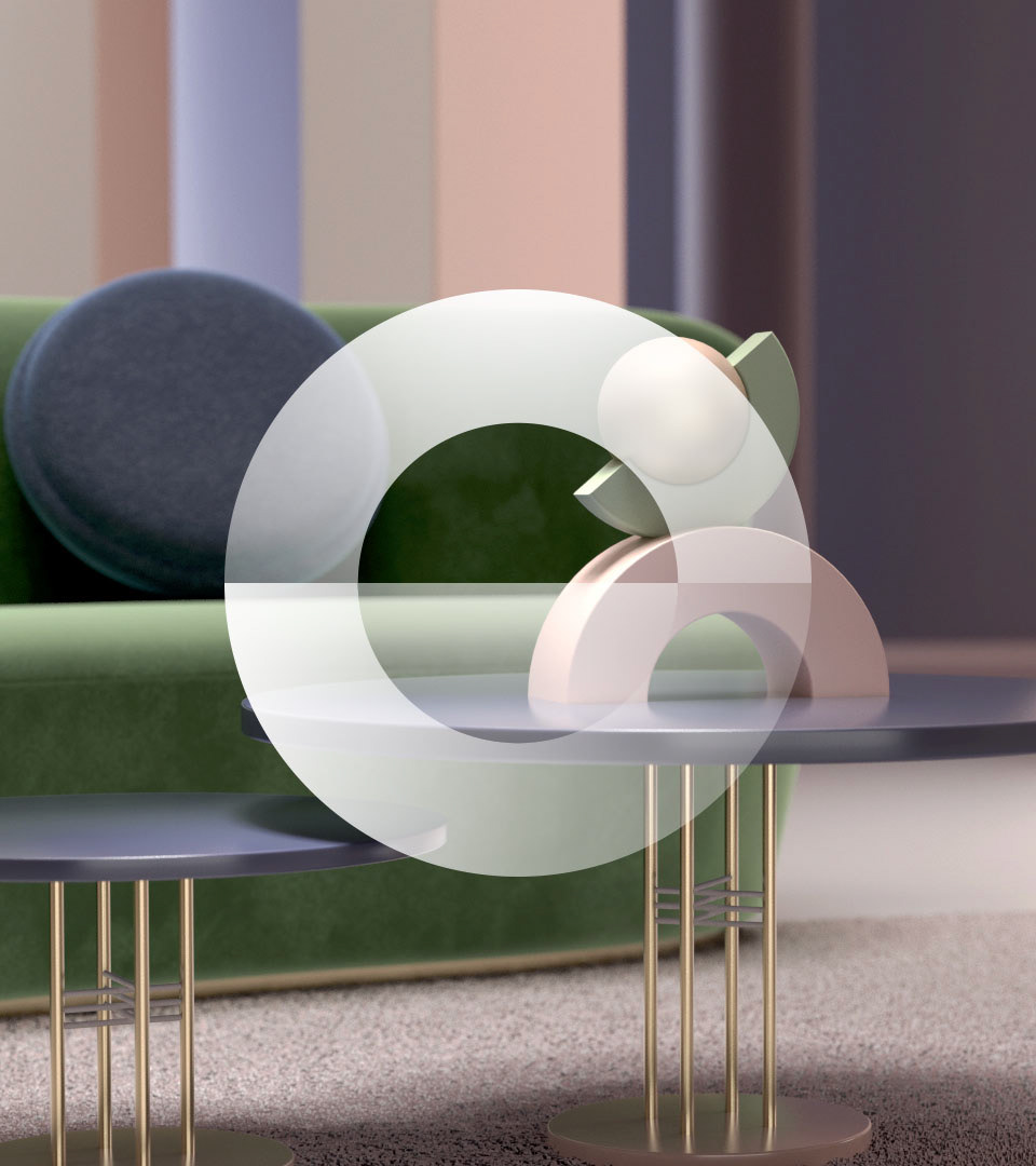
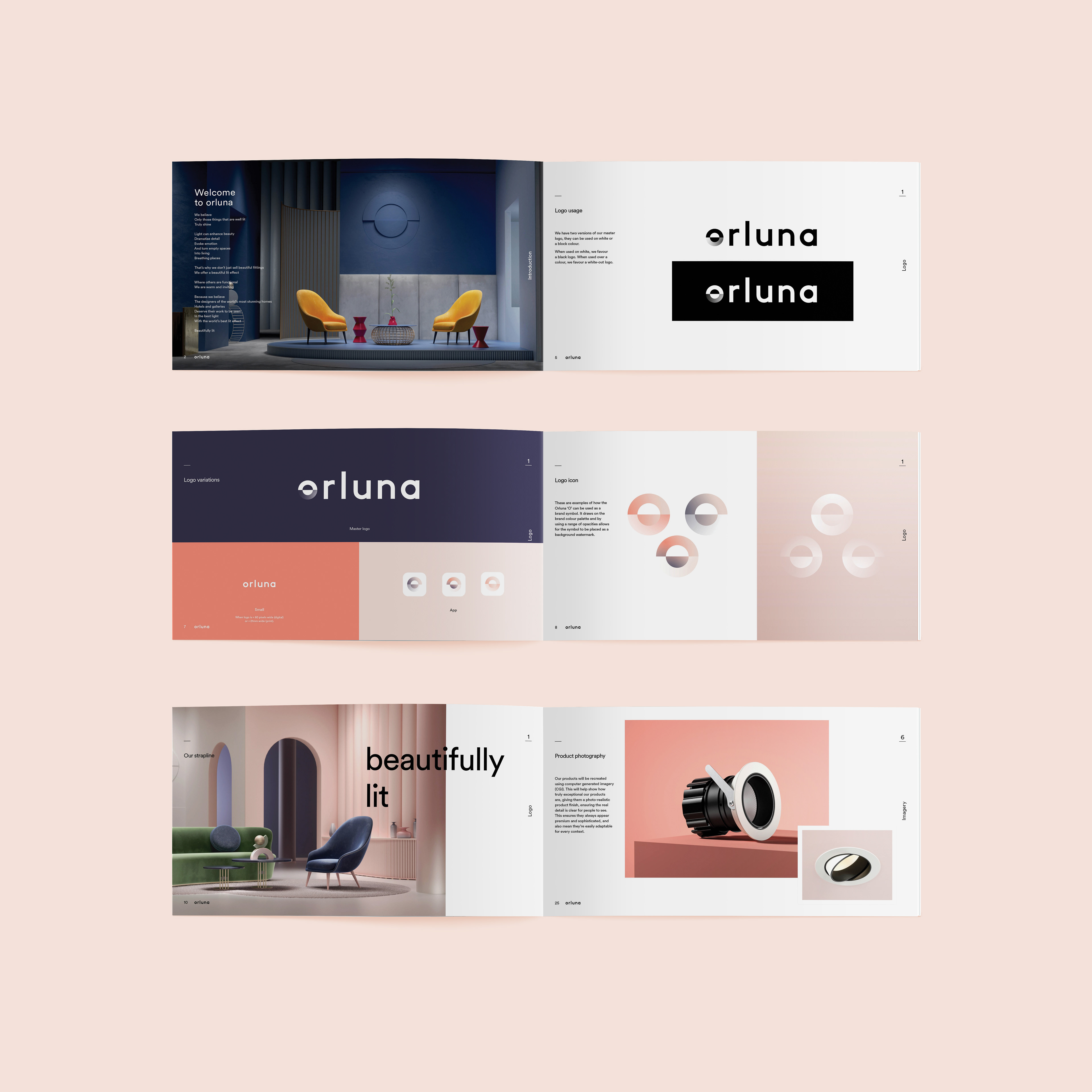
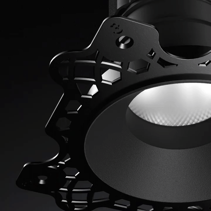
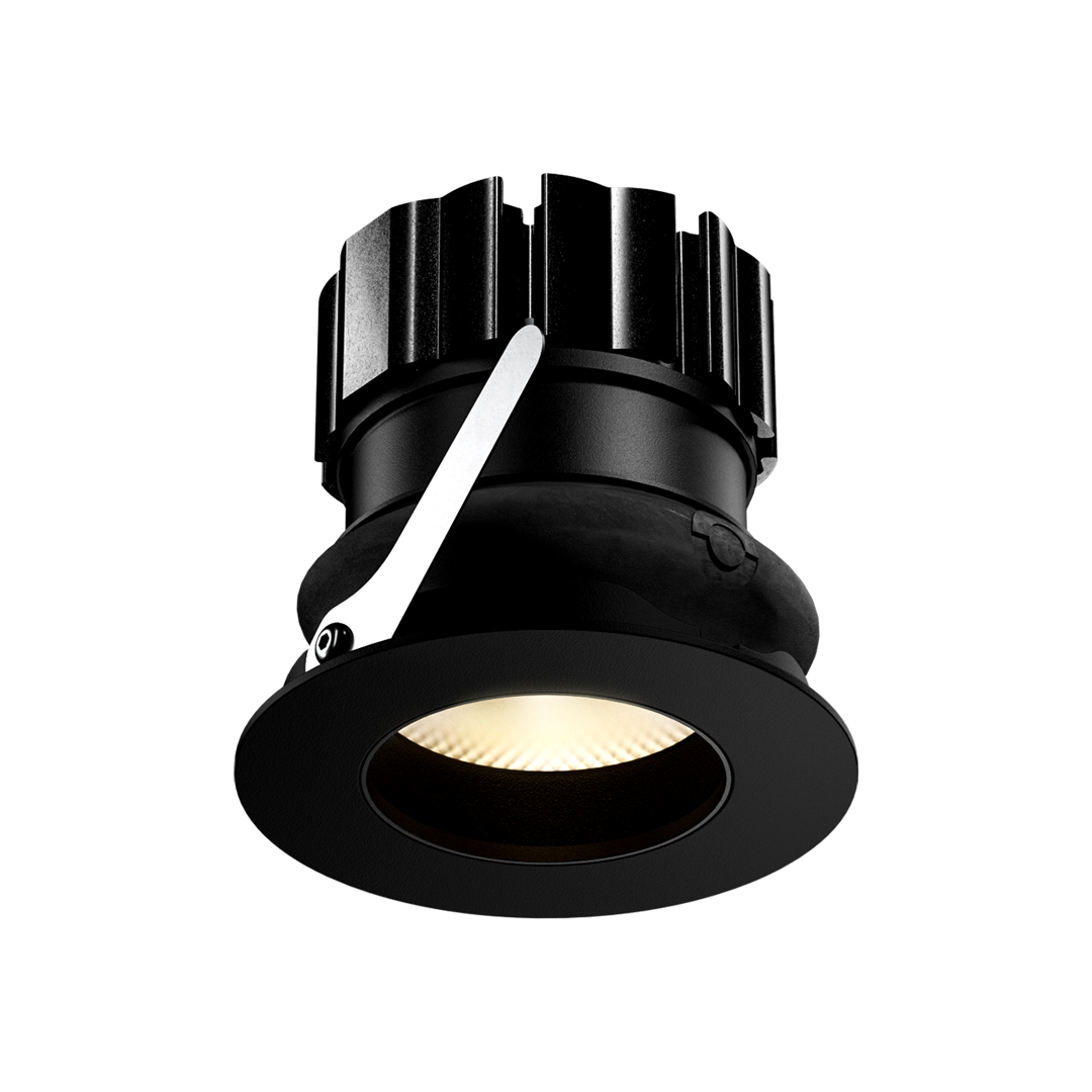
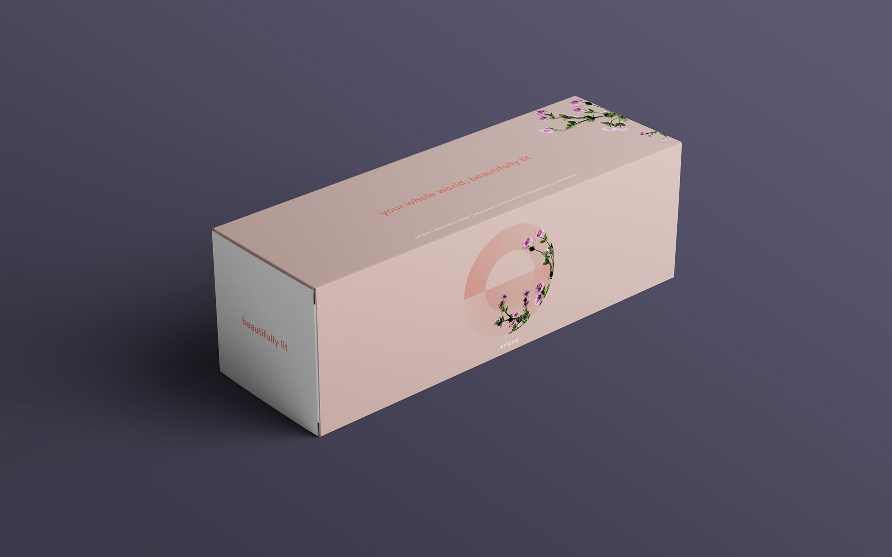
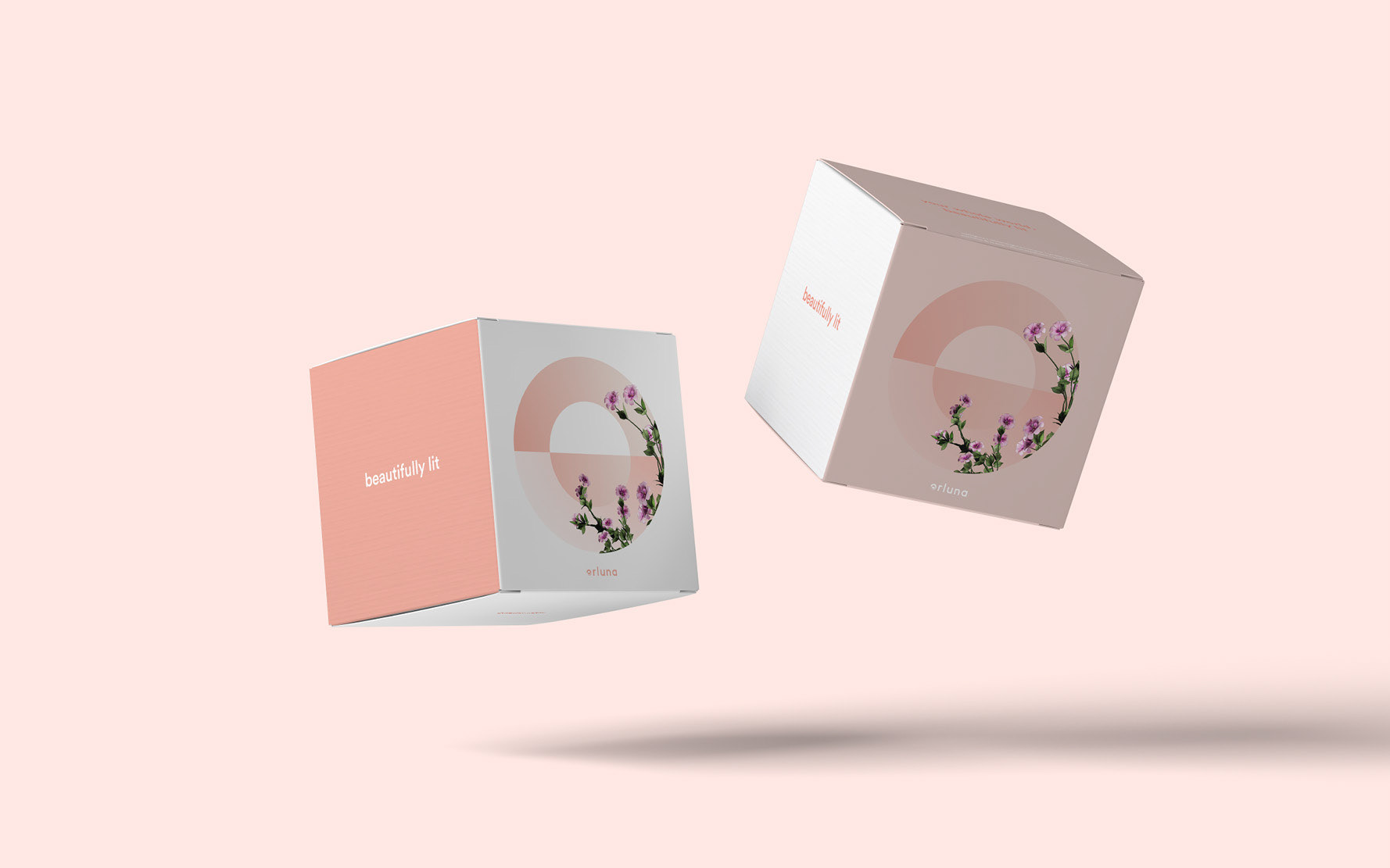
Orluna’s success has been built on the quality of its product. The logo is constructed from interlocking circles, made from the core of those very products: uplights, downlights and spotlights.The strong circular structure of the logo is inspired not just by the form and function of these lights, but the very nature of light itself. From astronomy to spirituality, the circle or sphere has long been synonymous with the form of perfect natural light. Natural light is the holy grail of lighting design and Orluna is at the very cutting edge, constantly striving for a ‘beautifully lit’ effect that is second only to the real thing. We have created a visual identity where the very essence of this light can be felt using the simplest of forms.
To complement these strong geometric forms, we needed a font that would match this boldness, but also be accessible and elegant. Circular (lineto) is a perfect marriage of purity, warmth and functionality, beautifully cementing the brand architecture with a typeface that effortlessly continues to elevate and enhance the entire brand.
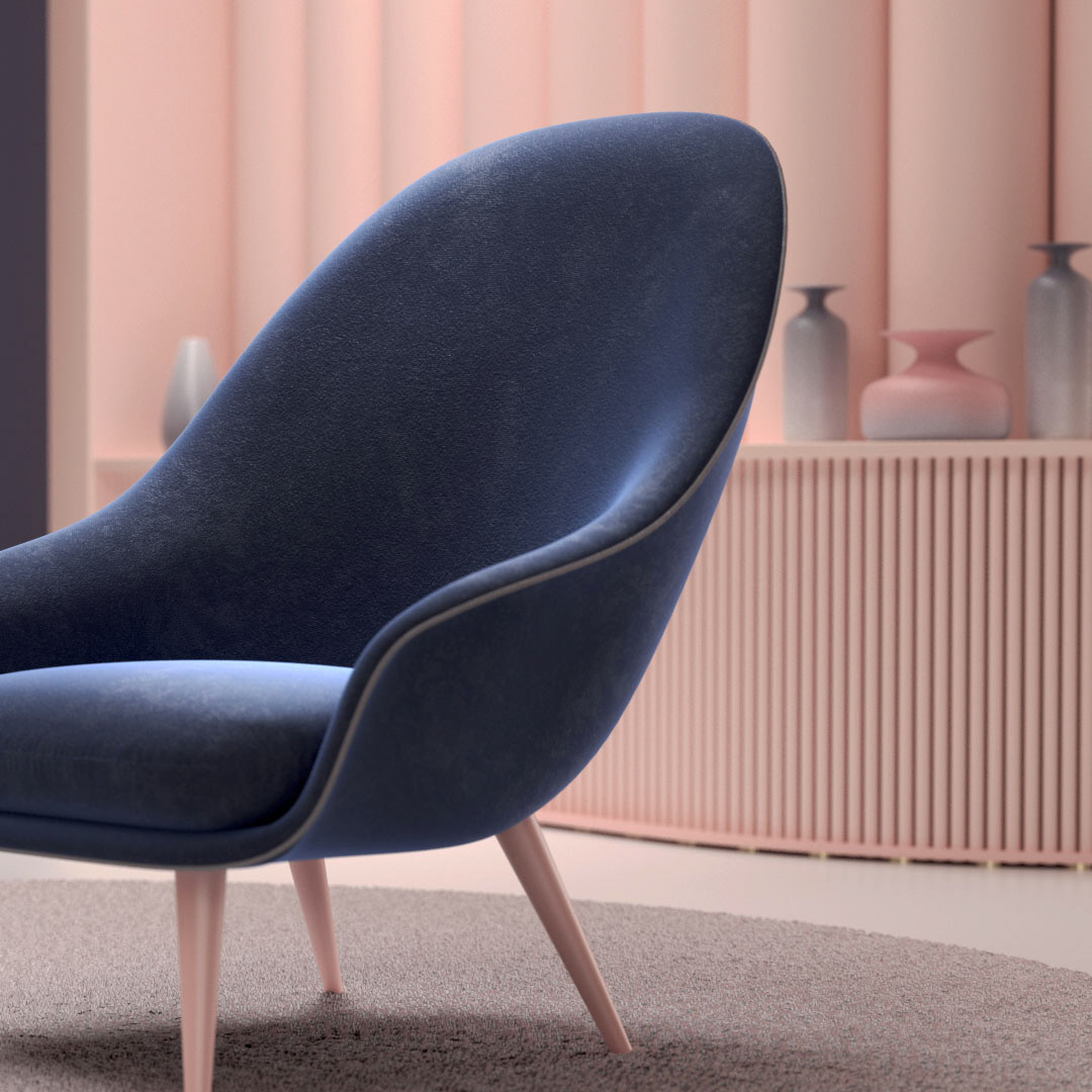
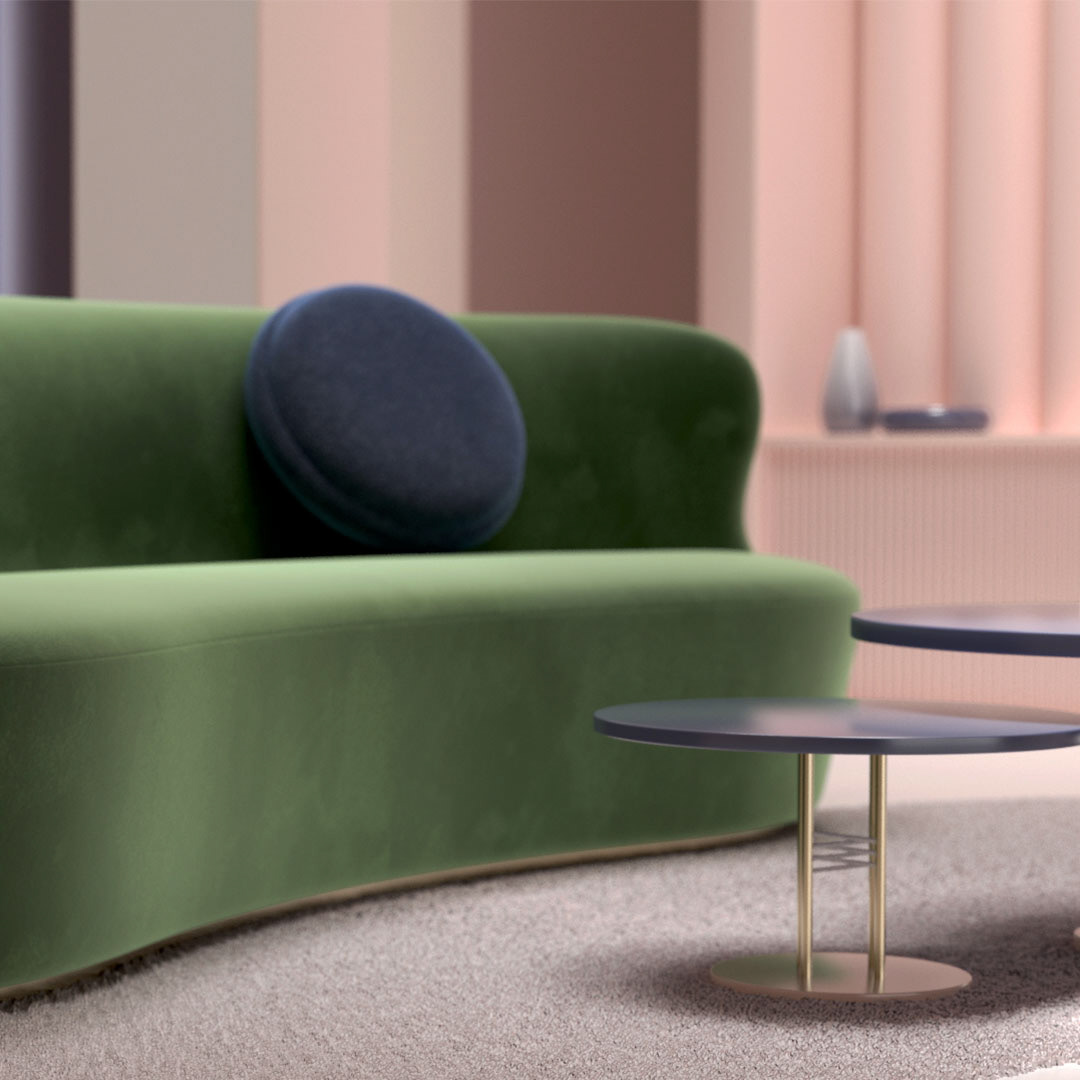
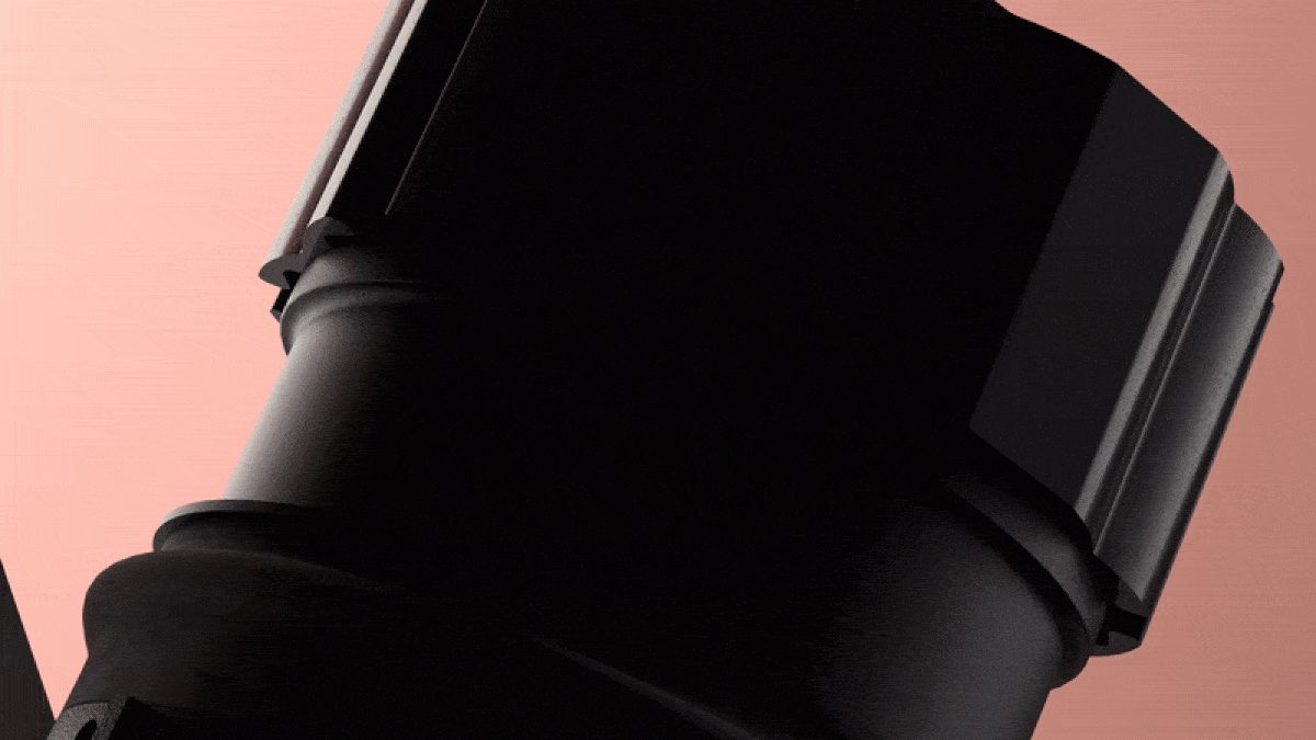
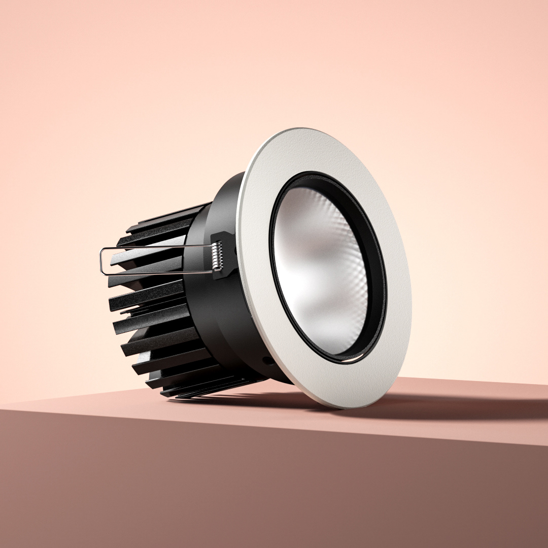
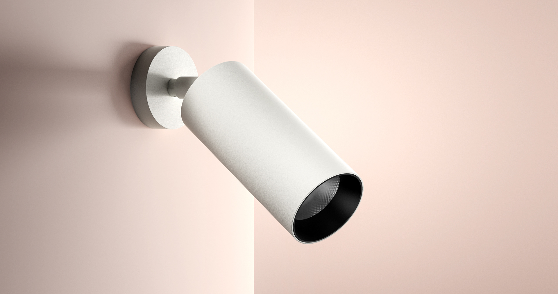
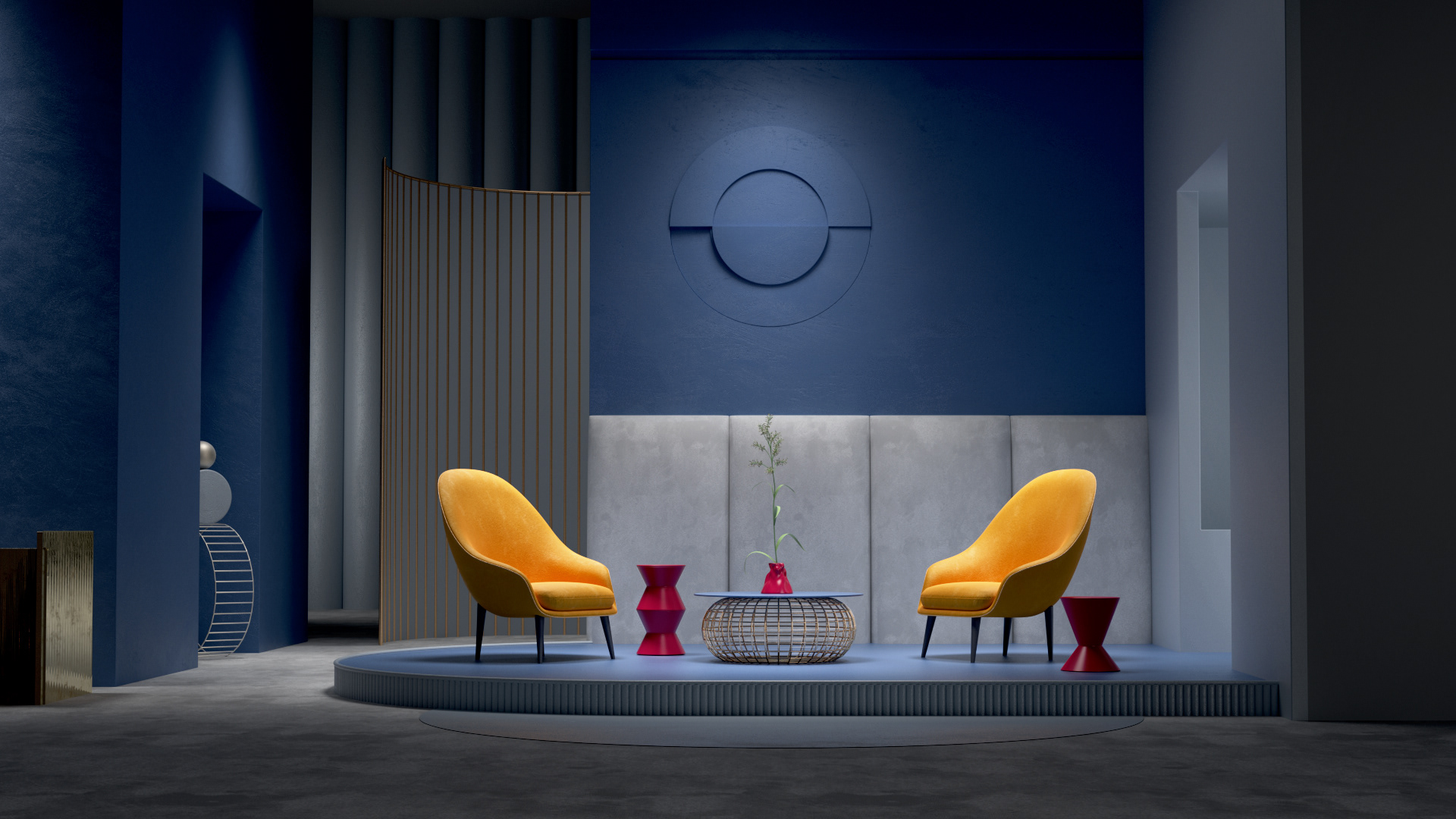
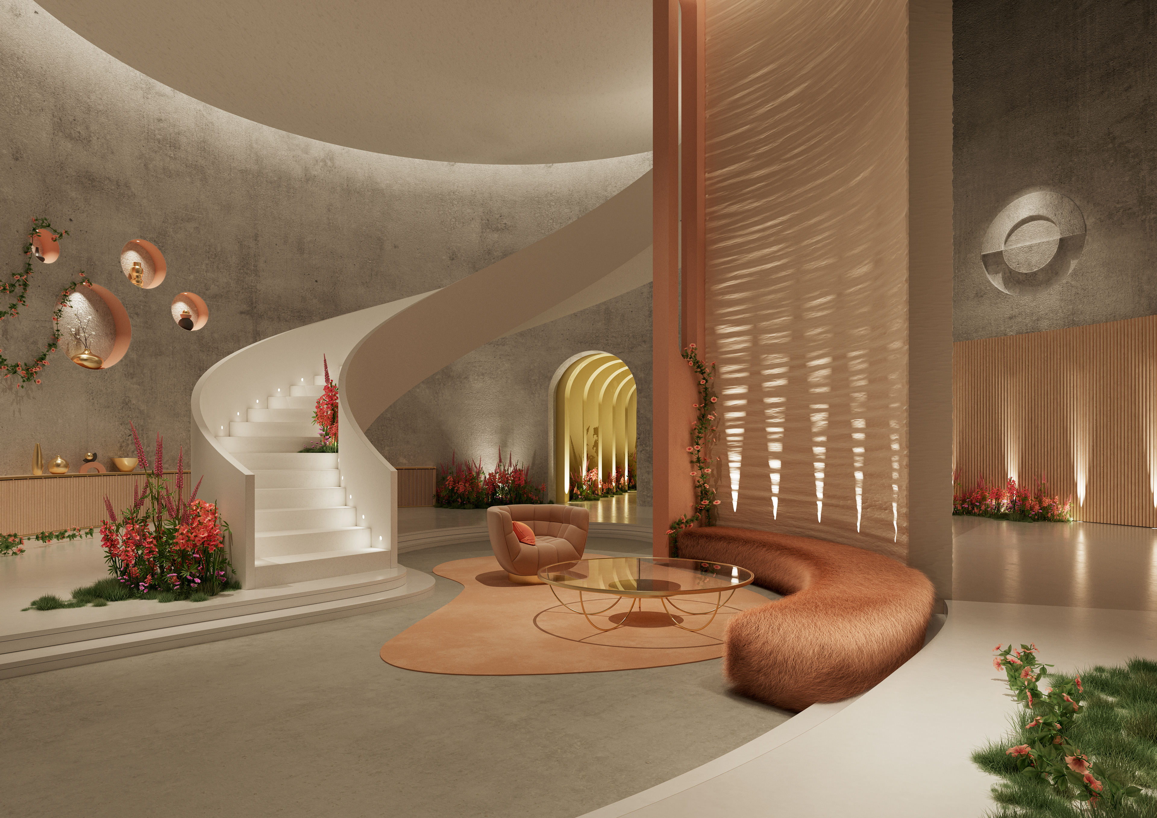
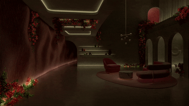
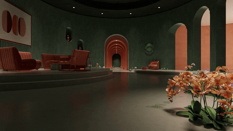
From the beginning of the project, we identified a heavy masculine bias to the sector. Our vibrant feminine palette was a major step change from the dark monochrome industry norm - with warm pink and coral tones giving a luxurious feel, and a distinctly modern edge. Our colours embody the ‘beautifully lit’ brand vision, by balancing these soft tones, giving Orluna a lighter touch that still commands attention. It was essential that these colours were not only all of these things, but also easy to live with. Like their lighting, we wanted these colours to have an emotional connection with the viewer, for them to feel and experience Orluna’s colours, not think about them.
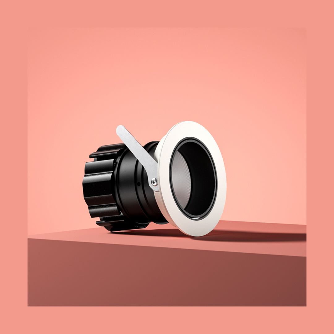
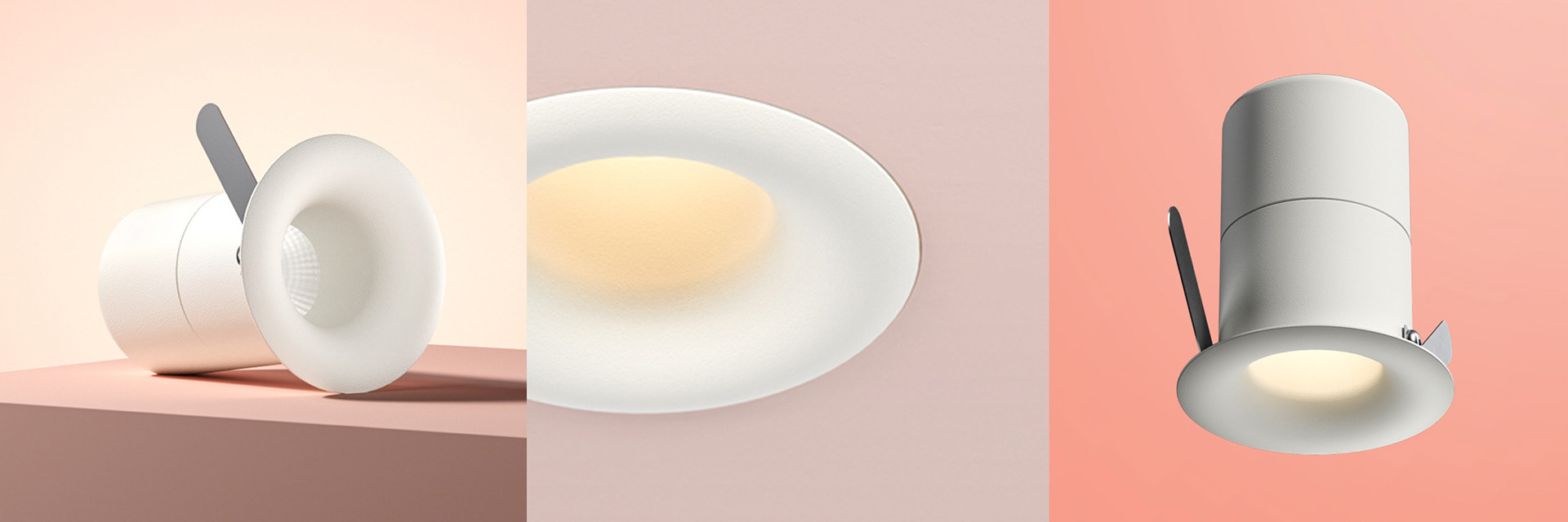
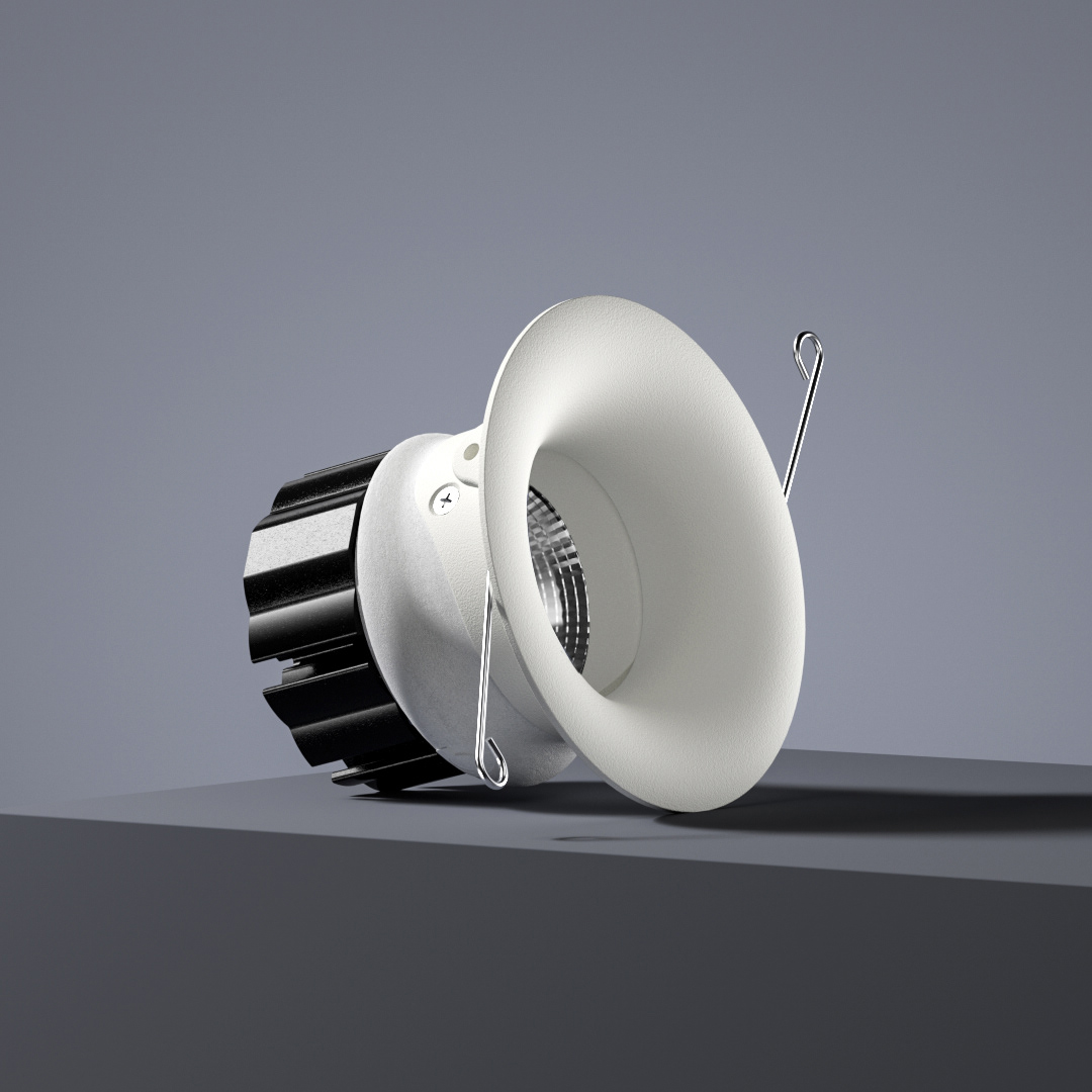
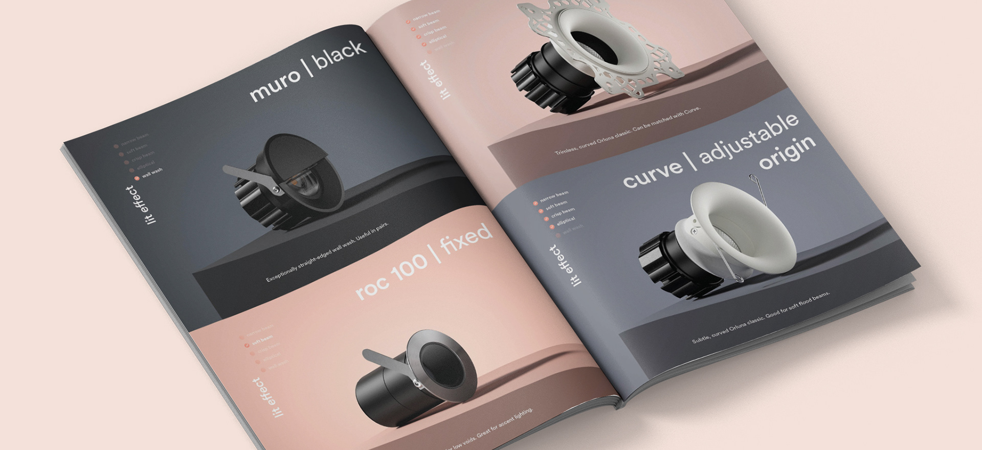
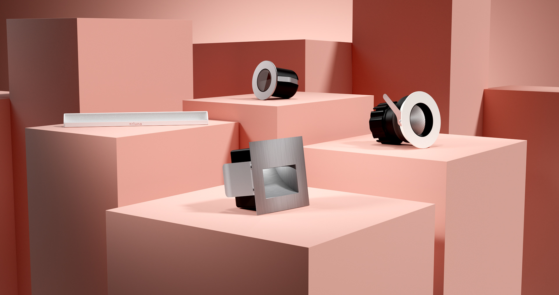
Commissioning 3D artist Gonzalo Miranda and FOUND, we collaborated to create beautiful CG renders of all the products, also using accurate lighting data to create considered aspirational environments, to showcase the ‘beautifully lit’ effect.